
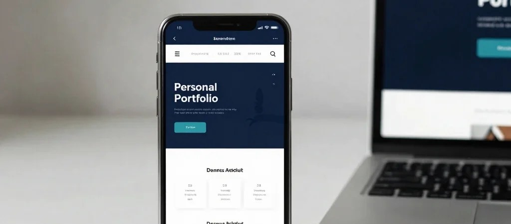
Imagine arriving at a portfolio because you want to know what someone has worked on. If the first screen is crowded with competing links, that basic question gets harder to answer. I think a useful website guides visitors from introduction to relevant details, then offers a clear next step.
Give Each Page a Purpose
An introduction should quickly explain who the site is about and what the visitor can explore. A portfolio can then present project context, the work involved, and any details the owner can accurately share. Separating those jobs makes the navigation easier to scan.
This is especially helpful when a site brings together different interests, such as ICT support and website development. A visitor can find each area without having to infer how the pieces relate or whether an idea is already an active business.
Design for the Small Screen
On a phone, long menus and dense blocks of text quickly become obstacles. Short headings, readable paragraphs, and links with clear labels help people find their way without pinching or hunting. It is worth checking that important pages and contact options remain easy to reach on a narrow screen.
A clean layout is not decoration for its own sake; it helps the content do its job. Before adding another feature, I would ask whether it makes the visitor’s next step clearer. If it does not, the page may be better without it.